
Guides → Materials, Colour & Character
Choosing Exterior Colours When the Brick and Roof Are Staying
Last reviewed September 10, 2026 · AI concept imagery · About 8 minutes read
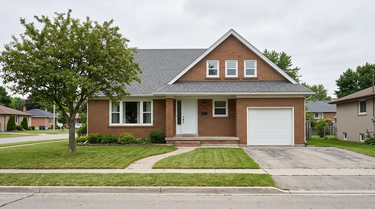
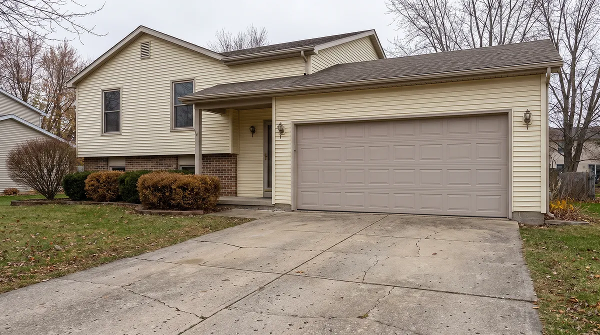
AI concept visualization for inspiration.
You have the samples on the kitchen table. One of them looked right in the store and looks wrong at home. You have a feeling that something is going to clash, and no clear way to say what.
That feeling may be pointing to something real. Often the trouble is between the sample and the colours already on the house that aren’t changing.
This guide won’t give you a palette. It can’t see your brick, your roof, your light or your street. What it can do is help you sort the decision, so the colours you choose respond to something specific on your house.
Start With What Is Not Changing, and Be Honest
About How Long
Most advice on this topic begins the same way: identify your fixed elements. That’s the right instruction, and it skips the hard part, which is deciding what actually counts as fixed on your particular house.
Staying for Good, Staying for Now
Brick is effectively permanent. It can be coated, which is a separate decision with its own consequences, but it isn’t something you change on a Saturday. Stone and foundations are the same.
A roof is different. It’s fixed in the sense that you’re not replacing it to suit a paint colour, but it also has a service life. A roof installed recently is a real constraint for as long as you’re likely to live with these paint colours.
A roof visibly near the end of its life is a weaker one, because the colour you’re carefully coordinating with today may be gone before the paint needs its first refresh.
That distinction is worth making before you start, because it changes which materials get a vote. If your roof is going to be replaced soon, you may be better served by choosing paint you actually want and then choosing the replacement roof to suit it, rather than committing the whole exterior to a shingle colour on its way out.
That’s your call, and it depends on your records, your roof’s condition and your timeline more than on any design principle.
How Much of the Roof the Street Actually Sees
You can check this in about a minute. Stand where a visitor would stand, at the curb or at the end of the driveway, and look at how much roof is in your field of view.
On some houses the answer is a great deal. A steep pitch facing the street puts a large coloured surface in the picture, and it will influence everything below it.
On others, particularly low-pitched roofs set behind a deep soffit, you can barely see the shingles from the ground at all. The roof is still there and still fixed, but it isn’t doing much of the visual work.
So a roof you can hardly see doesn’t need to guide your colours as much as one that fills the view.
Read the Fixed Materials as Colours, Not as Materials
Once you know what’s staying, the next step is to stop calling it brick and start describing what colour it is.
Brick and Mortar Are Not One Colour
Walk up to the wall and look closely. Most brick carries visible variation, sometimes considerable variation, within a single elevation. There may be warm reds alongside browns, or greys with something purple in them, or a yellow cast that only shows in afternoon light.
Then look at the mortar, which is a separate colour doing separate work. A pale grey mortar in a warm red wall cools the whole surface from a distance. A sandy mortar warms it. From the curb, the brick and mortar blend into one colour that neither material has on its own.
Describe that blended colour out loud: is it warm or cool, light or dark, and what’s the strongest secondary note in it? That description is more useful than the word brick.
The Surfaces People Forget
Fixed doesn’t only mean the house. Colour experts routinely list the driveway, the walkway, the foundation and permanent planting as part of the palette, because they sit in the same view as the house.
A wide concrete driveway can be a large light-grey surface in the overall view of your house. A warm-toned paver walk is a warm surface. Mature evergreens push a great deal of green into the picture, especially in shade.
There’s one more that catches people out. If a neighbouring wall sits close to yours, its colour can bounce onto your house in strong light. Painters describe exactly this effect, where nearby brick can push a beige toward pink, and heavy planting can push a grey toward green.
You don’t need to plan around all of it, but it helps to know it’s there before you decide a sample looks strange for no reason.
Warm or Cool Usually Matters More Than the Exact Shade
When a palette feels off, it’s often because two colours are pulling in opposite temperature directions, one warm and one cool.
You’ll see this point often in professional colour advice. A siding manufacturer’s rule of thumb for anyone re-siding over an existing roof is to pair warm with warm and cool with cool.
Exterior designers make the same observation about undertones, noting that warm siding under cool trim can feel mismatched even when both colours are pleasant on their own.
It’s a useful guideline. Deliberately cool colours against warm brick can still work on houses where the contrast is clearly intentional and supported by the rest of the palette.
What tends to look wrong is a near miss, like a slightly cool grey against a slightly warm brick, where the two almost match but don’t quite.
The trade-off is that staying inside one temperature family is safer but gives you fewer options.
If you want something with more tension in it, you’re taking on a harder problem, and the contrast needs to look deliberate.
Decide in Order of Surface Area
Not every house has the same amount of paint on it, so the decision order isn’t the same either.
The Largest Painted Surface Answers to the Brick
If your house has significant siding alongside the masonry, that siding is the colour with the least freedom. It sits directly against the fixed material across a large area, which is where a temperature conflict becomes most visible. Choose it in relation to the blended brick colour you described earlier.
Trim Is the Connector
Trim runs along the edges where materials meet, which means it’s what your eye uses to decide whether the whole thing was intended. It has more freedom than the body colour and less than an accent.
On a house that’s almost entirely brick with no siding at all, trim becomes the main painted decision rather than a supporting one, and it deserves the attention you’d otherwise have given the walls.
The Door and the Accents Are Where Preference Leads
A door is one of the easier places to introduce a colour that sits outside the main temperature logic, because it takes up much less visual area. If you’ve been holding onto a colour you love and can’t place, the door may be the place for it.
When You Do Not Like the Brick
Some readers arrive here having already decided the brick is the problem, and everything above assumes it stays. If that’s you, the real question is whether to paint it.
Painting brick is a real option, and it’s a consequential one.
Masonry is porous by design and moves moisture in both directions.
Coatings vary widely in how much they interfere with that, and where they do interfere, problems may not appear immediately, particularly in climates with repeated freezing and thawing. Reversal is difficult. Removing paint from masonry often requires abrasive methods that can damage the brick face itself.
Whether any of that applies to your wall depends on your brick, its condition, the specific product and your climate. It isn’t a question this or any general article can settle, and it’s worth a conversation with a qualified local masonry or painting professional before you commit.
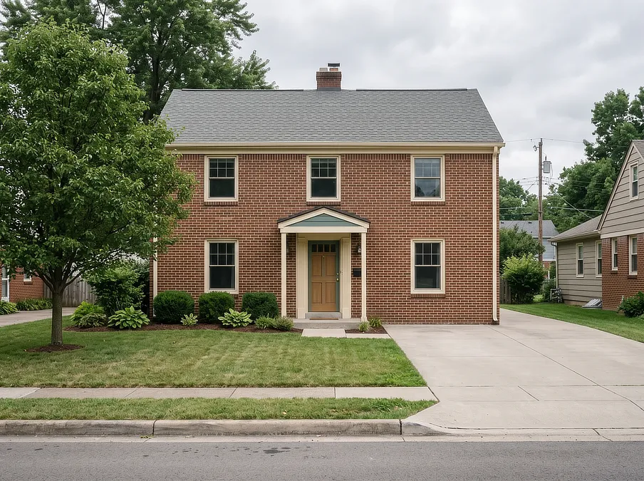
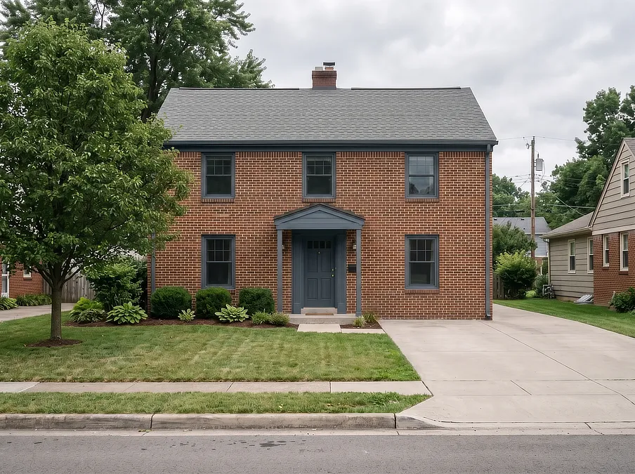
What’s worth knowing in the meantime is that brick doesn’t read as a fixed quantity. The colour beside it changes how it looks. Warm trim can make red brick read warmer and softer.
A deep, cool trim can pull the same wall toward brown and quiet it considerably. Before treating the brick as the thing that has to go, it’s worth seeing what it looks like next to a different trim colour, because that’s a much smaller decision that can still change how the brick reads.
Test Before You Commit
Everything above narrows the field, but it can’t tell you exactly what a colour will look like on your house. Testing is the practical way to find out.
Two things matter here. Colours can read lighter and brighter outdoors than they do on a chip under store lighting. And the same colour can read differently on different sides of the house and at different points in the day because the available light changes.
So use large samples rather than chips, and put them where the decision actually happens, directly against the brick and beside the trim.
Colour consultants recommend leaving white space around each sample or painting it on a board, because a swatch placed straight onto your existing colour gets judged against that colour rather than on its own.
Then look more than once, in the morning and evening, and on sunny and overcast days, because a colour that works in one kind of light may not work in another.
It’s slower than deciding at the store, and the wall looks patchy while you’re doing it, but you’ll know how the colour behaves before the whole house is painted.
What a Concept Can Show You, and What It Cannot
Curb Vibes concepts are fictional AI-generated visualizations, shaped and selected by human editorial judgment. When we build one, we set the fixed materials first, and everything else answers to them.
It’s the same order this article is asking you to use, and it helps keep a concept believable.
What a visual can do is show whether a direction belongs to a house. It can make a temperature conflict obvious in a way that words can’t, and it can show what happens when only the trim changes.
What it can’t do is confirm anything about a real wall. It doesn’t verify that a product suits your masonry, that a coating will behave in your climate, or that a condition on your house is what you think it is. Those questions need someone who can look at the actual building.
Where to Start
Before you look at another sample, write the list. Every material on your house that’s staying, and beside each one, the colour it actually is rather than the material it’s made of. Note which ones are permanent and which ones simply aren’t changing yet.
Then take a photograph of your own house from the curb and look at that instead of the house. A photo flattens the detail you’ve stopped noticing and shows you proportion, which surfaces are actually dominant, and how much of each material is really in view. Don’t use the photograph to judge exact colour.
Use the real samples outdoors for that, and use the photo for what’s big, what’s competing and what you’ve been walking past for years.
With the list in hand, you’ll be choosing from a shorter set of colours that already work with what’s staying.
Related Guides
Something Feels Unresolved, But You Can’t Name It?
The free 10-Minute Curb Story Check helps you identify what deserves to stay, what controls the first impression, and the first priority worth your attention.